Dec
Unveiling the New Face of Creativity: Liqwit’s Revamped Logo
In the ever-evolving landscape of creativity, a brand’s visual identity plays a pivotal role in conveying its essence and values. Today, we are thrilled to unveil the new face of Liqwit, our creative agency, through our revamped logo that encapsulates the spirit of innovation and artistic prowess.
Embracing Evolution
Embracing Evolution
As a dynamic creative agency, we understand the importance of staying ahead of the curve. Our decision to revamp our logo stems from our commitment to constant evolution and pushing the boundaries of imagination. The new design is not just a visual update; it’s a representation of our journey, growth, and adaptability in an ever-changing industry.
Symbolism and Aesthetics
Symbolism and Aesthetics
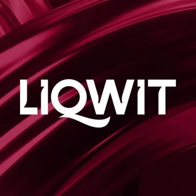
The refreshed Liqwit logo is a harmonious blend of modern aesthetics and timeless symbolism. The fluid lines and vibrant colors symbolize the fluidity of ideas, innovation, and the seamless integration of creativity into every project we undertake. The logo’s dynamic design reflects our ability to adapt to diverse challenges while maintaining a sense of cohesion and purpose.
A Crimson Symphony of Creativity
A Crimson Symphony of Creativity
Colors are the language of emotion, and our new color palette speaks volumes. The profound choice of Liqwit crimson red in our new logo is a deliberate ode to the intensity and passion that fuels our creative endeavors. This crimson hue isn’t just a color; it’s a statement – a symbol of the unwavering commitment Liqwit has to infuse each project with the fervor and zeal that sets us apart in the creative landscape.
Typography
Typography
The choice of typography in our revamped logo is deliberate, marrying modernity with a touch of classic elegance. The clean lines and bold strokes convey our commitment to clarity and excellence, ensuring that our message is not only heard but also remembered.
Client-centric Approach
Client-centric Approach
At Liqwit, our clients are at the heart of everything we do. The new logo reinforces our client-centric approach, symbolizing our dedication to understanding their unique needs and transforming them into captivating visual narratives. It’s not just a logo; it’s a promise of creativity that goes beyond expectations.
The Journey Continues
The Journey Continues
As we unveil our new logo, we invite you to join us on this exciting journey of creativity and innovation. The revamped logo marks a new chapter in our story, but our commitment to pushing creative boundaries, fostering innovation, and delivering excellence remains unwavering.
Thank you for being a part of the Liqwit family. Here’s to a future filled with limitless creativity, boundless possibilities, and, of course, our new emblem of inspiration – the revitalized Liqwit logo.
liquid minds. solid ideas.
liquid minds. solid ideas.


Sorry, the comment form is closed at this time.